VISUAL IDENTITY FOR A CYCLING EVENT
The project brief (2024) was to create a visual identity for an imaginary cycling event named Tour de Sibbo, taking place in Sipoo, Finland. The identity consists of a logo, typography, colors, graphical elements, and suggestions for photography. The idea was to create a presentation for the imaginary customer and "sell" the identity to them.
I wanted the identity to be a stylish, modern, and slightly playful take on a traditional sports event.
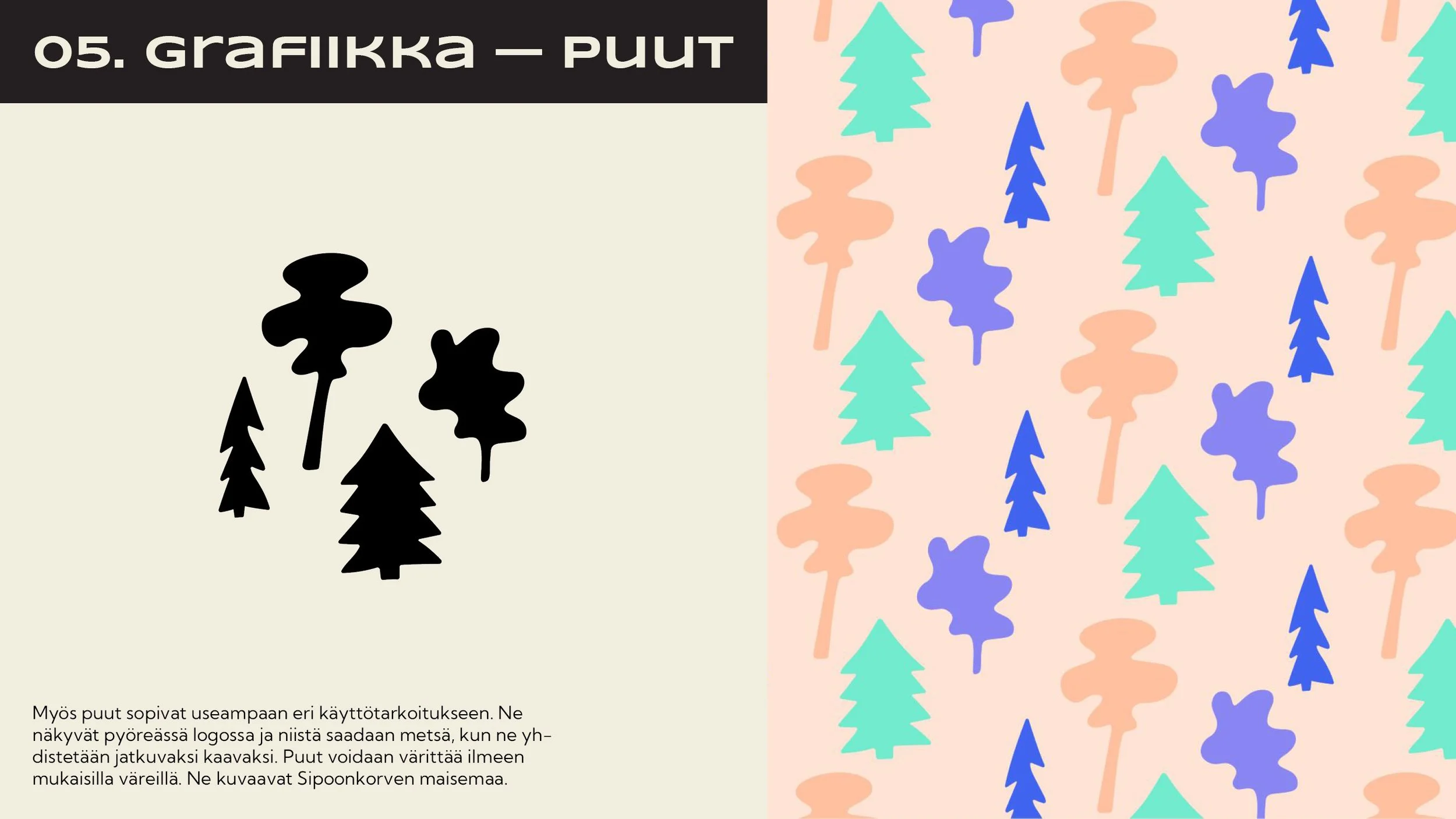
With the logo I designed, I wanted to clearly picture the nature of the event, hence the addition of half a bicycle tyre. The event takes place near the Sipoonkorpi National Park during autumn, and the half tyre can also be interpreted as a setting sun — a typical scene in Finland during that season. In the secondary round logo, I included trees to represent the forest, which is the main scenery of the event.
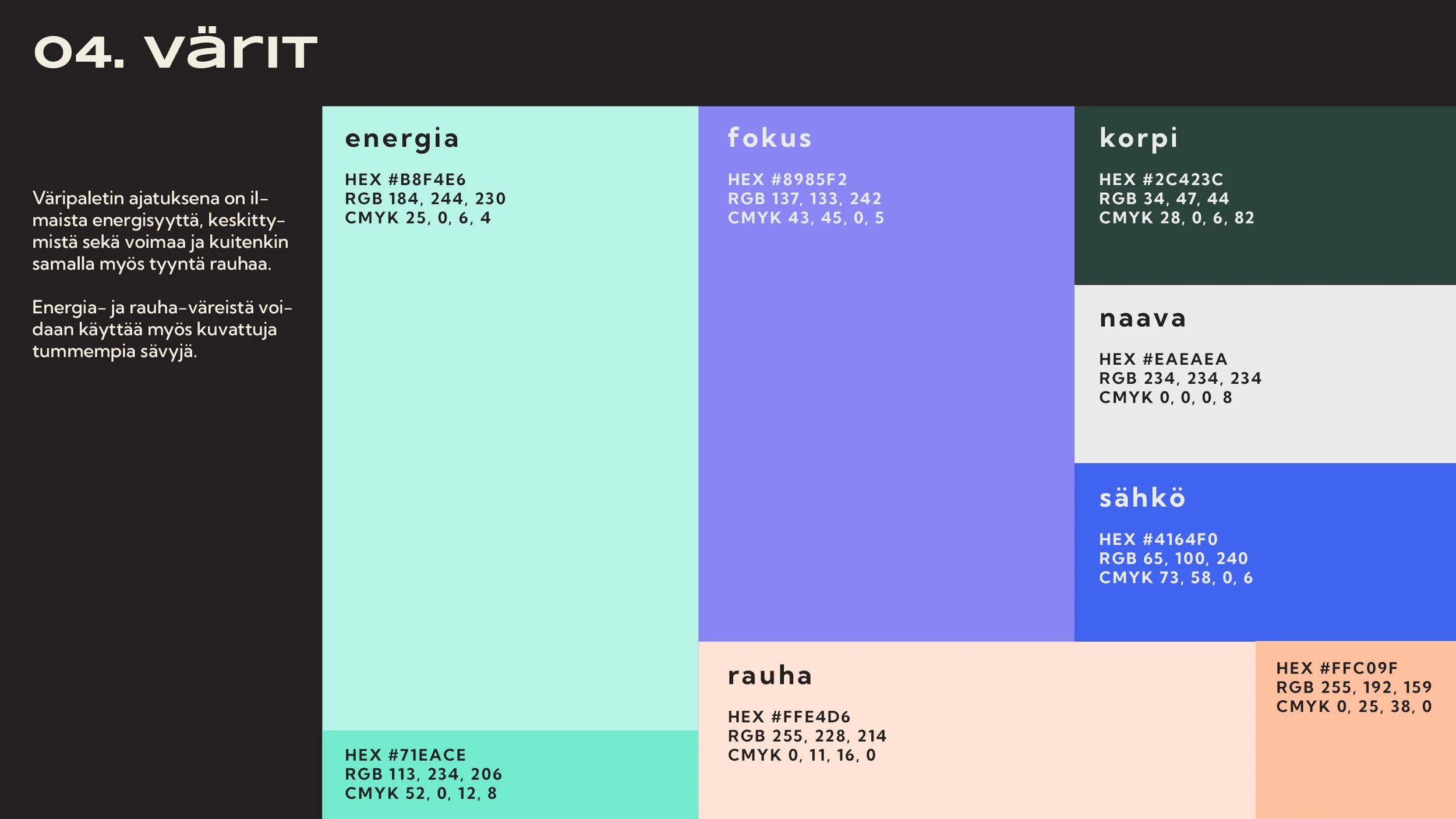
The colors communicate the energy, focus, and strength required for the event while also giving a calm and a peaceful vibe.
One of the graphic elements is an S-curve gravel path. The second element is the forest, also featured in the secondary logo.
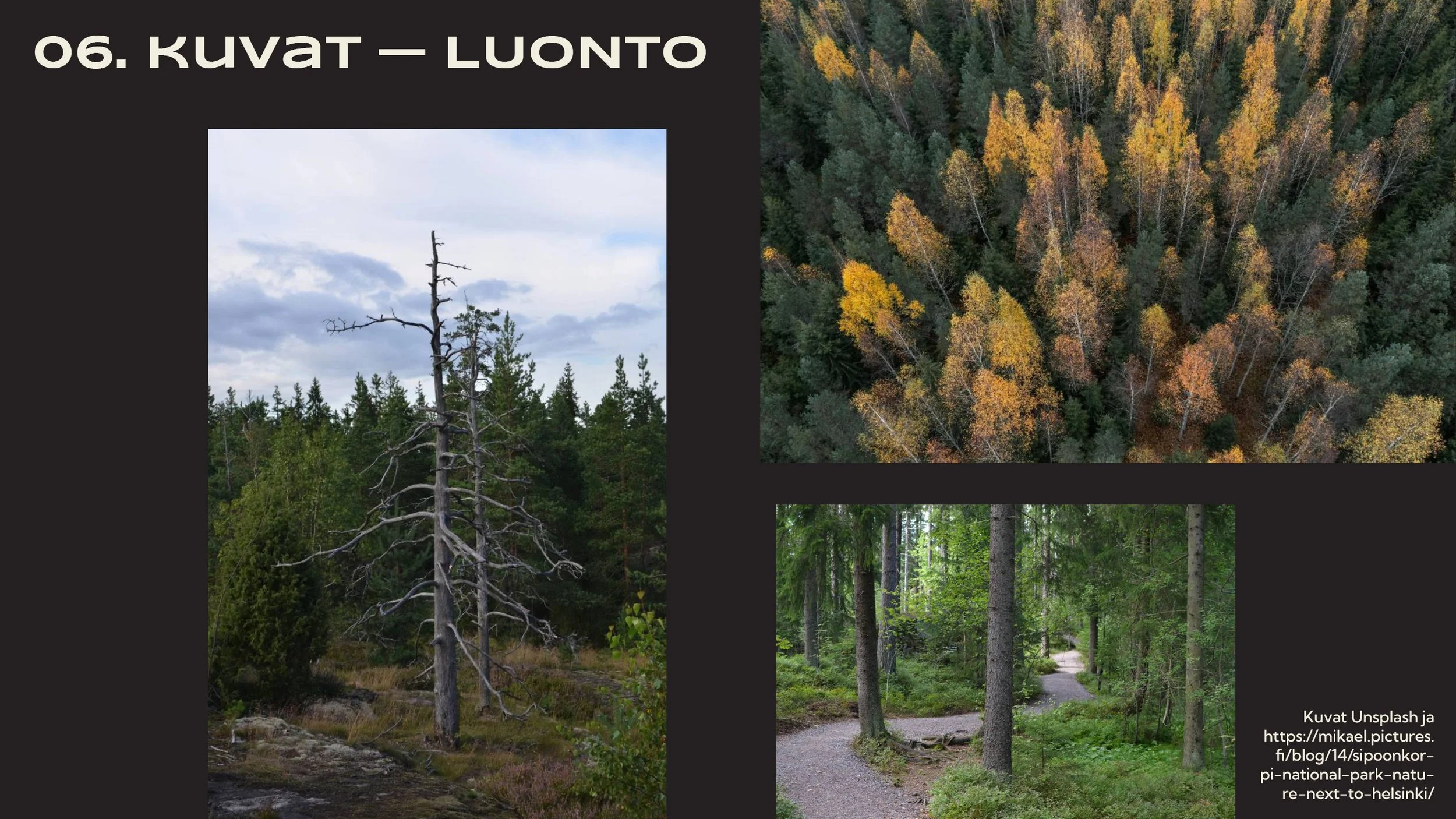
Photography follows the style of the rest of the identity.
I also created a short animation using the elements of the visual identity.